A selection of graphic design projects developed throughout my 8-year tenure at TELUS Digital (formerly TELUS International).
Avature Site
While working at TELUS Digital (formerly TELUS International), I was tasked with designing a dedicated page for the Gaming vertical within the existing corporate website.
Since there was no established visual direction for this vertical at the time, I proposed a design approach that aligned with the brand’s existing guidelines while incorporating visual elements more closely associated with the gaming industry.
The primary objective was to highlight available job opportunities and showcase the company culture within this sector. As the final copy had not yet been defined, I developed the layout using placeholder text to focus on structure, hierarchy, and visual flow.
To differentiate the Gaming vertical from the others, I strategically incorporated more of TELUS’ “Thunder” gray from the brand’s color palette. Although the brand typically restricts the use of colors outside the secondary light gray palette, we decided to emphasize the darker gray tone to give this vertical a distinct and more immersive identity.
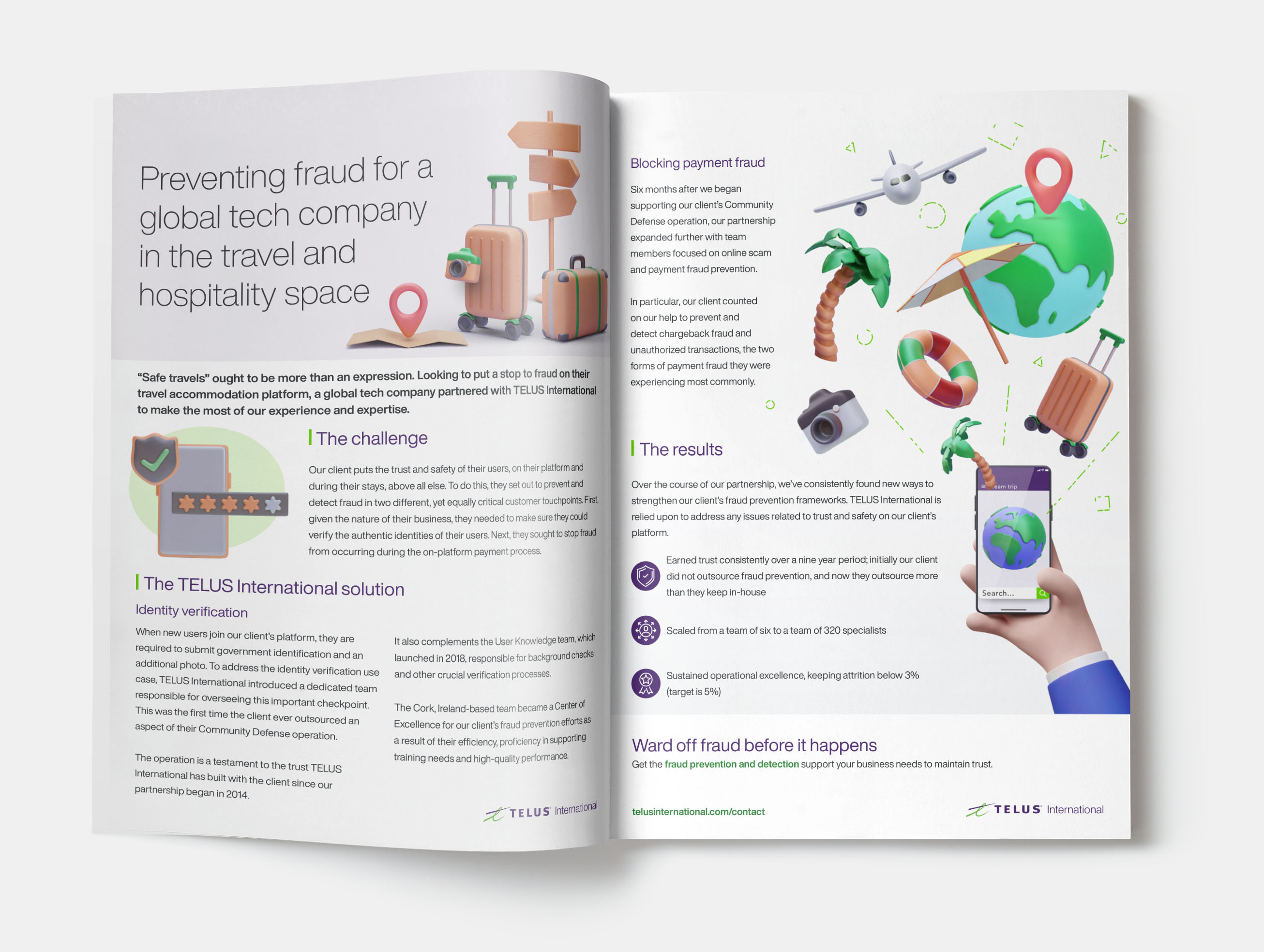
Editorial Design

and visual flow.
To differentiate the Gaming vertical from the others, I strategically incorporated more of TELUS’ “Thunder” gray from the brand’s color palette. Although the brand typically restricts the use of colors outside the secondary light gray palette, we decided to emphasize the darker gray tone to give this vertical a distinct and more immersive identity.
Corporate illustrations